With the number of coffee shops and cafes that have sprung up over the past few decades it can be hard to establish a market presence and develop a recognizable brand. One great way that you can distinguish your cafe from all the others is via your logo design.
In this article we discuss cafe logos and what designers are typically doing for clients in this industry. We also offer a number of coffee shop logo ideas that may give you a clearer idea of what you are looking. This information should help you when it comes to filling out a briefing form for your designer.
Target Market and Location
It is important that you have a logo that is a perfect match with the market demographics that you are targeting. A design for a cafe in a sophisticated up market downtown area would be very different from a design for a coffee shop in a suburban shopping mall.
Understand your clientele so that your designer can take them into account. Think of what impression you want the customer to get when they see the logo. Write down a list of words that you can give to your designer such as sophisticated, old fashioned, fresh, warm, inviting etc
Ideas on Color Choice
A good designer will usually use a range of no more than two or three colors. Brown is the obvious choice for a cafe logo as it is the color of coffee beans. However brown can be pretty dull and conservative so be open-minded to brighter colors as well.
Common Concepts and Images
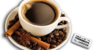
The most obvious image for a coffee shop logo that springs to mind is a cup of coffee. The coffee bean is the other obvious choice. While some of the top coffee shop chains have incorporated a coffee mug into their logo, this idea has perhaps been overdone and you might do well to consider other images. Your store frontage and signage should make it obvious to passers by that you are in the coffee business so you really don’t have to reinforce this by having an image of a cup. Starbucks has one of the most unconventional logos in the industry with an image that is totally unrelated to coffee. Simple text logos without any image at all can also work well.
Font Styles
A good designer will be able to create a logo with a font that compliments the image. To allow viewers to easily read and understand the coffee shop name, the font should be bold and uncomplicated.
Other Cafe Logo Considerations
Make sure that your logo doesn’t imitate those of other cafes, particularly those of the big players like Starbucks. The public will likely view this as lame and in the worst case scenario you may end up facing legal action for trademark infringement. Seek inspiration from other logos in the food and beverage service industries but make sure that you come up with a final design that stands out as being truly unique.
The logo that you select for your coffee shop will have to be versatile. Think of all the possible uses before you finalize your choice. Small versions of your logo will need to be displayed on business cards and coffee cups and larger versions will be necessary for building or vehicle signage. Think about where your business is going in the long term. Is it likely that you will sell coffee beans in bags under your own brand?
When it comes to marketing a cafe a logo design is one of the best investments that you can make. Spend at least a few hundred dollars to hire a custom logo company to create something that gives you the brand image that you need to draw in the crowds and make your coffee shop a success.


